
On Fables and Nuanced Charts
While data visualizations appear to present information objectively, they are laden with assumptions. Some of those assumptions are held by the chart maker, and others are held by you.
In this Column, Spencer Greenberg and Amber Dawn Ace explain how charts can inadvertently manipulate reality.
In 1994, the U.S. Congress passed the largest crime bill in U.S. history, called the Violent Crime Control and Law Enforcement Act. The bill allocated billions of dollars to build more prisons and hire 100,000 new police officers, among other things. In the years following the bill’s passage, violent crime rates in the U.S. dropped drastically, from around 750 offenses per 100,000 people in 1990 to under 400 in 2018.

But can we infer, as this chart seems to ask us to, that the bill caused the drop in crime?
As it turns out, this chart wasn’t put together by sociologists or political scientists who’ve studied violent crime. Rather, we—a mathematician and a writer—devised it to make a point: Although charts seem to reflect reality, they often convey narratives that are misleading or entirely false.
Upon seeing that violent crime dipped after 1990, we looked up major events that happened right around that time—selecting one, the 1994 Crime Bill, and slapping it on the graph. There are other events we could have stuck on the graph just as easily that would likely have invited you to construct a completely different causal story. In other words, the bill and the data in the graph are real, but the story is manufactured.
Perhaps the 1994 Crime Bill really did cause the drop in violent crime, or perhaps the causality goes the other way: the spike in violent crime motivated politicians to pass the act in the first place. (Note that the act was passed slightly after the violent crime rate peaked!)
Charts are a concise way not only to show data but also to tell a story. Such stories, however, reflect the interpretations of a chart’s creators and are often accepted by the viewer without skepticism. As Noah Smith and many others have argued, charts contain hidden assumptions that can drastically change the story they tell.
This has important consequences for science, which, in its ideal form, attempts to report findings as objectively as possible. When a single chart can be the explanatory linchpin for years of scientific effort, unveiling a data visualization’s hidden assumptions becomes an essential skill for determining what’s really true. As physicist Richard Feynman once said: In science, “the first principle is that you must not fool yourself, and you are the easiest person to fool.”What we mean to say is—don’t be fooled by charts.
Misleading Charts
Bad actors have long used data visualizations to deliberately manipulate and mislead. How to Lie with Statistics, a classic book from 1954, describes tricks that unscrupulous actors use to distort the truth without fabricating results, such as by truncating the y-axis of a chart to make an effect look much larger than it is or by cherry-picking data.
Drug companies and special interest groups have employed these techniques for decades to win public support. Merck, for example, was accused of publishing misleading data about the anti-inflammatory drug Vioxx to hide the fact that it could cause heart attacks and strokes, ultimately resulting in a multi-billion dollar settlement.
But even when no one is intentionally trying to mislead or manipulate, charts designed to make information clear can still lead to erroneous conclusions. Just consider the U.S. maternal mortality statistics, which seem to show maternal deaths rising from 0.4 deaths per 100,000 women in 2003 to close to 1 per 100,000 in 2020.


This graph is worrisome, particularly if you or your partner is pregnant (or expect to be). Why are so many more expectant and new mothers dying? Is there some new danger? Is the healthcare system getting worse? Coverage in Scientific American, NPR, and elsewhere suggested that the answer to these questions was “yes.”
In May 2024, however, Saloni Dattani reported in Our World in Data that the purported increase in U.S. maternal mortality stems mostly from changes in how these deaths are counted. Before 1994, the International Classification of Diseases (ICD) defined a “maternal death” as one where pregnancy is listed as the underlying cause of death on the death certificate. However, this led to many maternal deaths not being counted, including cases wherein the underlying cause of death was a condition that is exacerbated by pregnancy.
When the ICD was updated in 1994, the definition was expanded to include deaths from “any cause related to or aggravated by the pregnancy or its management.” The ICD also recommended “pregnancy checkboxes” on death certificates to help doctors catch more pregnancy-related deaths.
Dattani shows that as U.S. states gradually introduced the pregnancy checkbox and implemented the new ICD definition, rates of maternal death appeared to rise. So, it seems that the upward trend in the graph doesn’t come from changes in the actual death rate but from changes in what counts as a maternal death, to begin with. None of this is indicated in the charts, which plot smooth lines without any gaps or discontinuities.
The pre-1994 definition of maternal deaths seems reasonable enough, but it led to an undercounting of deaths plausibly affected by pregnancy. The new pregnancy checkbox systems, on the other hand, seem to overestimate maternal deaths. In addition, the box is often checked by accident; in 2013, it was checked 187 times for people over the age of 85, according to reporting by Emily Oster. There also appears to have been a real uptick in U.S. maternal deaths in 2021, perhaps related to COVID-19.
Other charts are misleading not because the definition of a term changes over time—as with maternal mortality—but rather because of a lack of agreement on how to measure a variable to begin with.
Consider the following three charts, which plot the growth in U.S. workers’ pay against the growth in overall productivity. Each seems to tell a different and contradictory story.


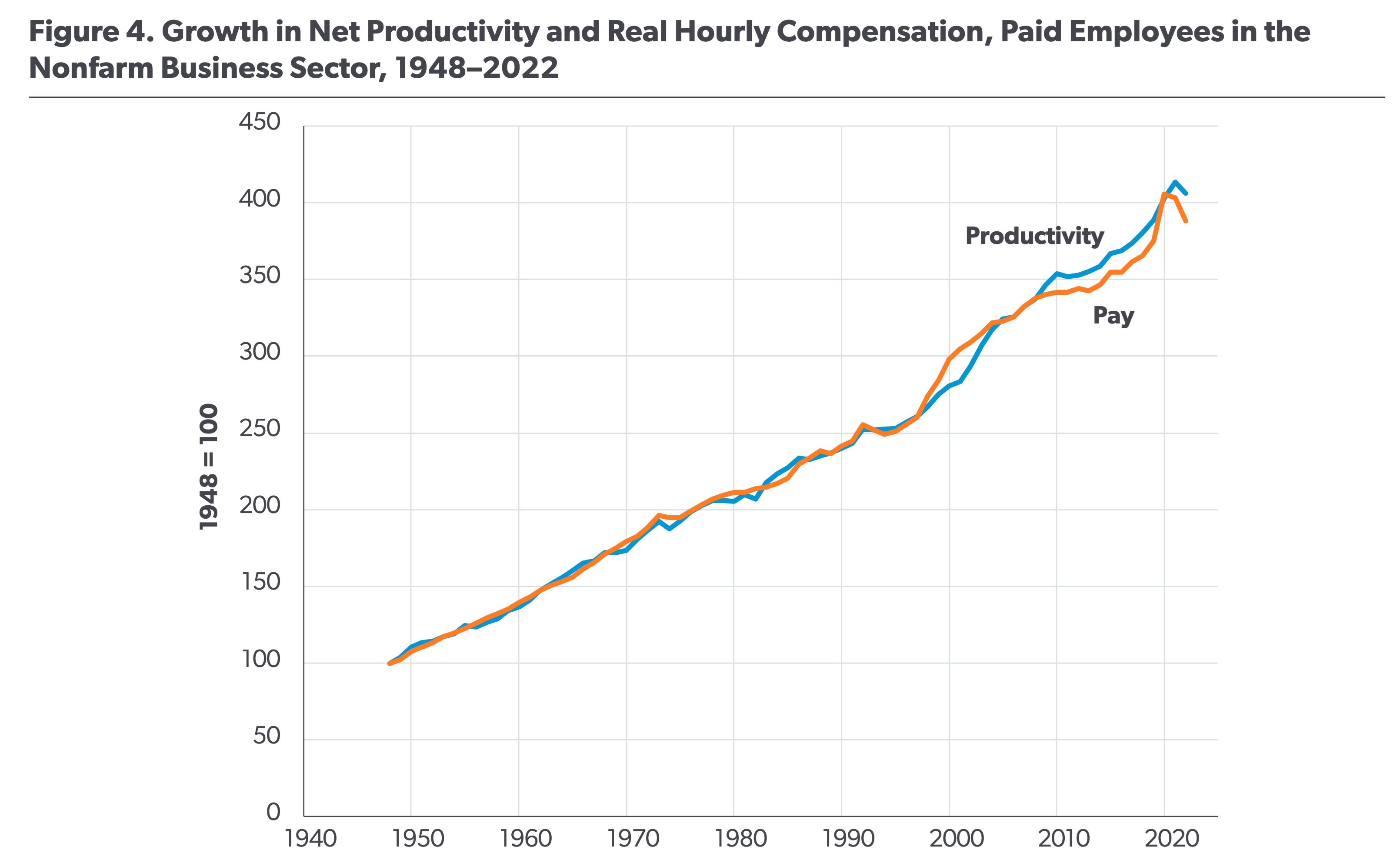
The first chart suggests that workers’ hourly pay has barely budged since the 1960s, even as productivity has skyrocketed. The second chart shows a more modest divergence. And the final chart seems to show the opposite; that increases in wages have generally followed increases in productivity. What’s going on? Scott Winship, a sociologist at the American Enterprise Institute—and creator of the third chart—argues that these differences stem from researchers measuring worker pay and worker productivity in different, and sometimes incompatible, ways.
If your job is creating shoes from start to finish, it’s fairly straightforward to measure productivity: it’s merely the dollar value of the shoes you make each year based on market prices. If you were instead an assembly-line worker who makes only a single part of each shoe, measuring productivity becomes somewhat more complicated. And for other professions that are even further removed from the production of objects or goods, measuring productivity becomes far more complicated still.
Winship argues that the first chart shows the pay and productivity of different sets of workers, thus creating a misleading divergence. Specifically, it plots the productivity of workers in the “nonfarm business sector,” but the pay is for “private production” and “nonsupervisory workers.” These groups don't exactly match: some workers are included in the productivity measure but not the pay measure, and vice versa.
The second chart shows the productivity of the entire economy, which is calculated by dividing GDP by the total hours worked. This, too, seems to be flawed. GDP includes rent payments from tenants to landlords, as well as a hypothetical “imputed rent” from homeowners to themselves. These real and imputed rents may go up when the price of real estate rises, but it doesn’t mean that homeowners have somehow become more productive.
Another challenge in measuring productivity is that for some workers—such as government employees—their productivity is conventionally measured by their pay. It would be misleading to include such workers in these charts since their pay would appear to keep pace with productivity no matter what.
A political debate underlies these interpretations. The first two charts may be used to bolster anti-capitalist sentiment, suggesting that the modern economic system has created greater societal wealth without fairly compensating workers. Winship’s analysis—written for a center-right think tank—paints a rosier picture of capitalism, suggesting that societal wealth has enriched workers in kind.
Regardless of who’s correct, these charts reveal how even seemingly simple metrics can be deeply contested below the surface. Making charts requires answering tricky questions like: Whose pay? What sort of productivity? And what features of the data are most salient?
Finally, there are instances where researchers who tried their best to be objective find themselves stymied by their own charts.
In 2010, psychologist Daniel Kahneman and economist Angus Deaton researched the correlation between income and day-to-day happiness, or “hedonic well-being,” among U.S. residents. The duo asked 1,000 U.S. residents whether they’d experienced a large amount of a specific emotion, such as “sadness,” “worry,” or “enjoyment,” during the previous day.
After collecting their data, Kahneman and Deaton grouped responses into “positive affect”—for positive emotions such as happiness and laughter—and “blue affect” for emotions like sadness and worry.

Their research seemed to show that day-to-day emotional happiness increases alongside income, but only up to about $75,000 per year. After that, happiness tapers off; very rich people seem just as happy as those who make $75,000. Because Kahneman and Deaton’s findings support a worldview that appeals to many people, one in which money isn’t that important for happiness, it received a great deal of media attention.
In 2021, however, economist Matthew Killingsworth tried and failed to replicate their work with new data. What he found was that hedonic well-being did not taper off at incomes above $75,000 per year. Kahneman, to his credit, teamed up with Killingsworth to investigate the discrepancy.
Together, Killingsworth and Kahneman discovered that the drop-off in well-being could be found in Killingsworth’s data, but only for the 20 percent of the population with the lowest emotional well-being. In other words, people who experience lots of negative emotion get happier as they make more money, but the effect stops at incomes greater than $75,000 a year. However, for the remaining 80 percent of people, their day-to-day positive emotions do tend to increase as they get wealthier, even above $75,000 a year.
Kahneman and Deaton missed this observation in their earlier study because they hadn’t realized that their questions measured whether a person is unhappy but not how happy they are. Most happy people—whether only a bit happy or very happy—replied the same way to the questions, so they couldn’t be differentiated. When the data were analyzed in a more granular way using better data, the economists discovered that it is not happiness, but rather a reduction in unhappiness, that tapers off after $75,000. In short, some people are wired such that even favorable changes in their circumstances cannot make them measurably more happy over a certain point.
Whenever a measurement involves asking people questions, as will be necessary with subjective measures like well-being, then the meaning of that measurement hinges on how those individuals interpret and respond to questions. This example also shows that data visualizations can mislead even brilliant people who make a living as scientists. Kahneman was a Nobel Prize winner extremely famous for his contributions to psychology, yet he made what he later realized was a measurement mistake that led him to form an inaccurate model of the world.
Manipulating Reality
While inaccurate models of the world based on charts and data visualizations may seem mostly trivial, they can occasionally mean the difference between life and death.
Take, for example, the Space Shuttle Challenger disaster of 1986. Seventy-three seconds after liftoff, the shuttle exploded, tragically ending the lives of seven astronauts and costing taxpayers billions of dollars. The prior day, engineers working on the rocket had sent charts to NASA with evidence that it was not safe to launch due to the forecast of cold weather and the way that o-rings (circular seals used in the shuttle) responded to cold temperatures. Unfortunately, and despite the noble efforts of these engineers, the story that higher-ups took away from these charts was not one of serious danger.

However, even when the stakes are not as high, careful interpretation of data can make the difference between an accurate understanding of something important about the world and a false one. As Adam Mastroianni puts it: “Believing true things ultimately makes you better at persuading people and manipulating reality, and believing untrue things does the opposite.”
A chart that tells a story that America is a backwater where pregnant people die inexplicably is inaccurate and potentially harmful. And so are inaccurate charts that support politically motivated conclusions, whether it be that happiness doesn’t increase with income over a certain threshold or that economic productivity only serves the managerial class.
To avoid producing a chart that misleads scientists, which misleads journalists, which misleads the public, and which then contributes to widespread confusion, you must think carefully about what you actually aim to measure. Which representation of the data best reflects the question being asked and relies on the sturdiest assumptions?
After all, scientific charts are a means to read data rather than an explanation of how that data is collected. The explanation comes from a careful reading of methods, parameters, definitions, and good epistemic practices like interrogating where data comes from and what could be motivating the researchers who produced it.
In the end, the story a chart tells is still just that—a story—and to be a discerning reader, you must reveal and interrogate the assumptions that steer those narratives.
***
Spencer Greenberg is the founder of ClearerThinking.org and Spark Wave, and is the host of the Clearer Thinking podcast, which is a podcast about ideas that matter.
Amber Dawn Ace is a freelance editor, working with people who want to make the world better. Her interests include teaching, mental health, emotions, philosophy, and relationships.
Cite: Spencer Greenberg & Amber Dawn Ace. “On Fables and Nuanced Charts.” Asimov Press (2024). DOI: https://doi.org/10.62211/72kr-98we
Correction: An earlier version of this article incorrectly dated the Space Shuttle Challenger Disaster. It occurred in 1986.
"Take, for example, the Space Shuttle Challenger disaster of 1986. Seventy-three seconds after liftoff, the shuttle exploded, tragically ending the lives of seven astronauts and costing taxpayers billions of dollars. The prior day, engineers working on the rocket had sent charts to NASA with evidence that it was not safe to launch due to the forecast of cold weather and the way that o-rings (circular seals used in the shuttle) responded to cold temperatures. Unfortunately, and despite the noble efforts of these engineers, the story that higher-ups took away from these charts was not one of serious danger."
There's another way in which this is similar to the Kahneman / Deaton data, what's not shown in the data is that the amount of hot gas that passed the O-rings was much higher on 51C (the coldest) than was seen on other flights, and that on 61A much less (as indicated by the amount of soot in the space between the primary and secondary O-ring. This indicated that the O-rings sealed more quickly and completely on the latter, despite the fact that three distinct field-joint O-rings were bypassed by hot gas.
That information was discussed verbally on the call, so the people at NASA who made the launch decision were aware of it, and certainly Thiokol management who changed their minds from recommending against a launch to recommending it went ahead were aware of it because the person who brought it up was in the room with them. However it was not shown on the chart.
Very interesting and illuminating article on how data visualisation and statistical analysis can be interpreted and presented in 'stories'. And the pitfalls of 'cherry picking' the data to suit the stories!!